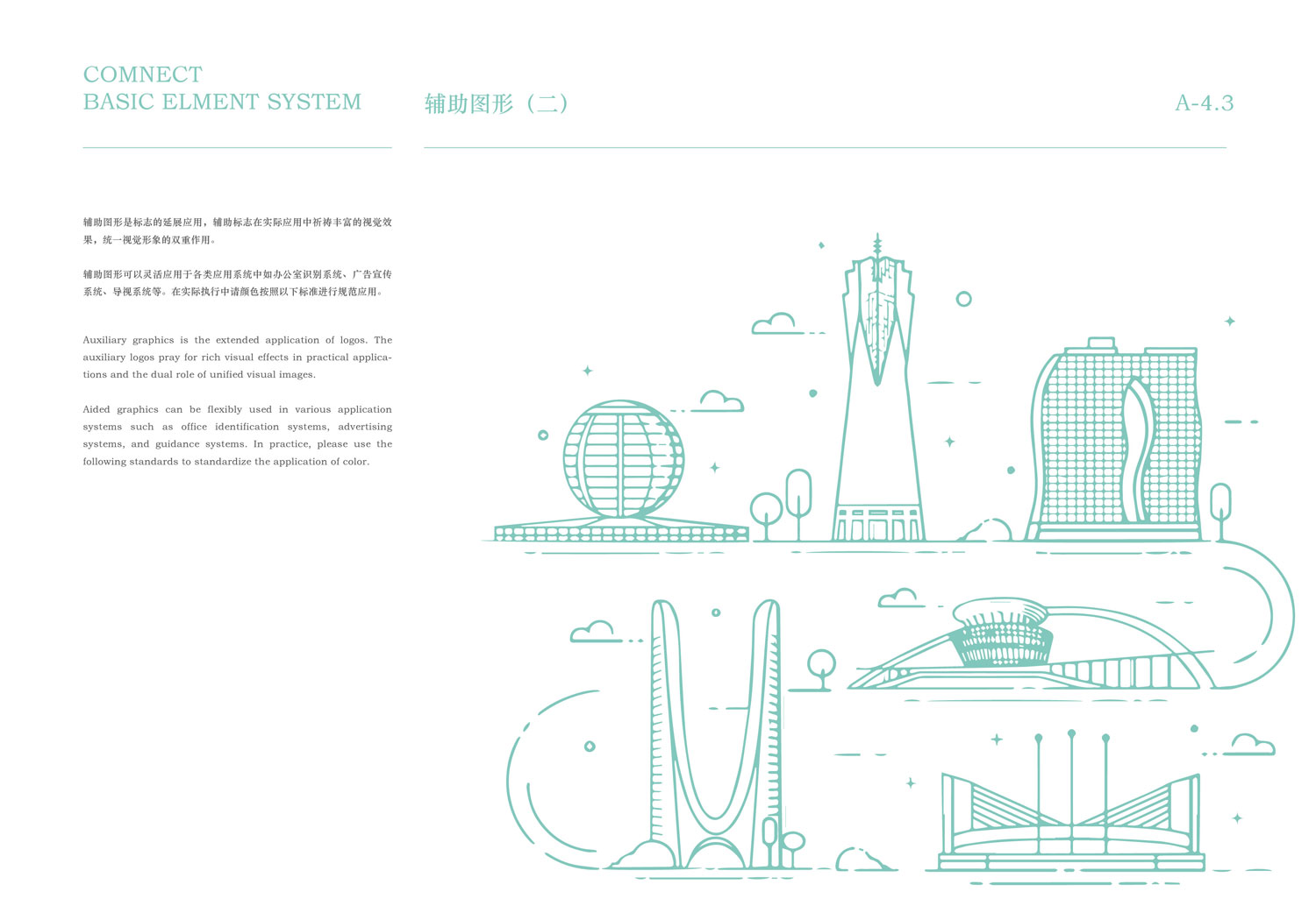
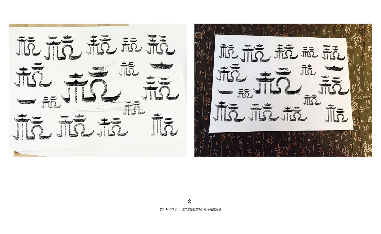
杭州LOGO城市形象标志的设计理念和元素确实很精彩,充分体现了杭州独特的文化和建筑特色。以下是对设计灵感的总结和评价:
建筑元素的提炼:
亭子和龙船作为杭州传统建筑的代表,通过屋檐的形状巧妙地融入到LOGO中,不仅展现了古建筑的典雅,还寓意了杭州作为水乡城市的特色。
圆形拱门的象征:
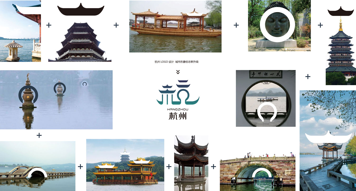
圆形拱门作为杭州古建筑的特征,被用来提炼LOGO中的笔画,展示了城市文化的开放和包容,同时也增添了一种古典美感。
文化遗产的表现:
LOGO中的建筑元素不仅仅是装饰,更是对杭州丰富文化遗产的尊重和传承。从亭子到拱门的提炼,都反映了杭州作为历史名城的独特魅力。
水乡特色的体现:
龙船和湖中游船的造型突出了杭州作为水乡城市的形象,强调了城市与水资源的深刻关联和和谐发展。
主题的统一和传递:
整体设计不仅具有视觉上的吸引力和艺术价值,更重要的是,它成功地传递了关于杭州丰富历史、自然风光和文化精髓的故事,让人们可以通过这个LOGO更深入地了解和感受这座城市的魅力和独特之处。
杭州城市形象LOGO的设计不仅是对城市形象的精准诠释,也是对文化和历史的生动表达。通过巧妙地融合建筑、自然和文化元素,这个LOGO不仅是一个标识,更是一种城市精神的象征,能够有效地提升和传播杭州的形象和吸引力。
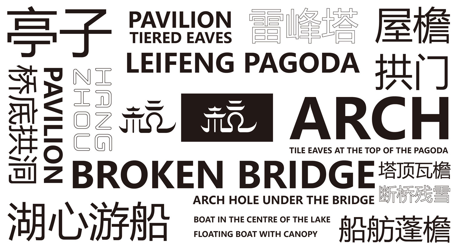
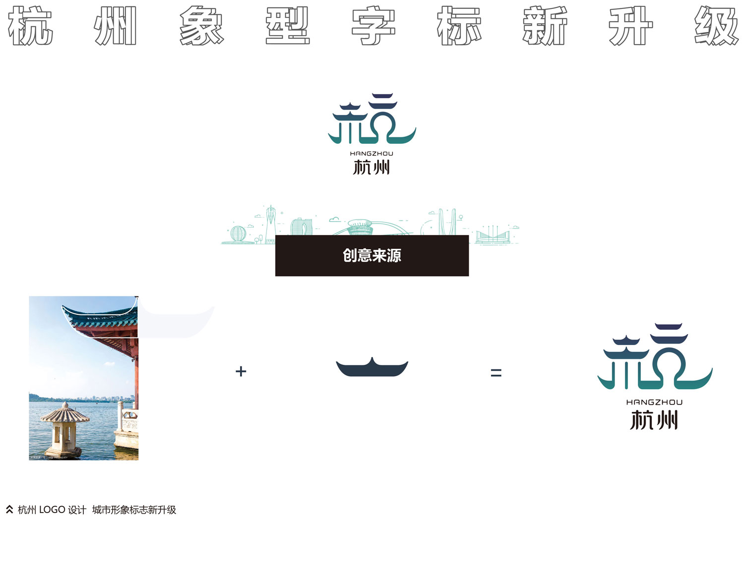
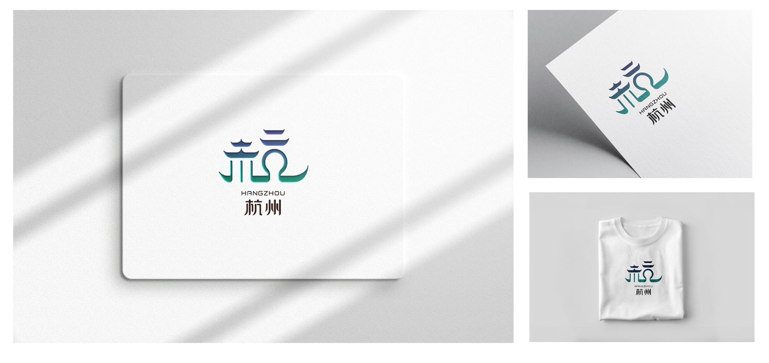
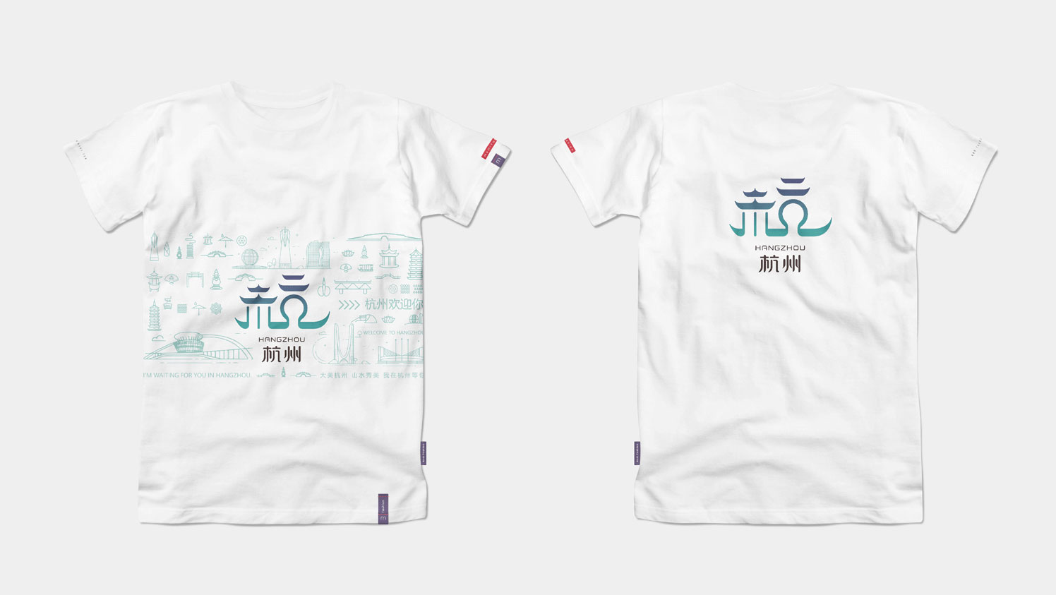
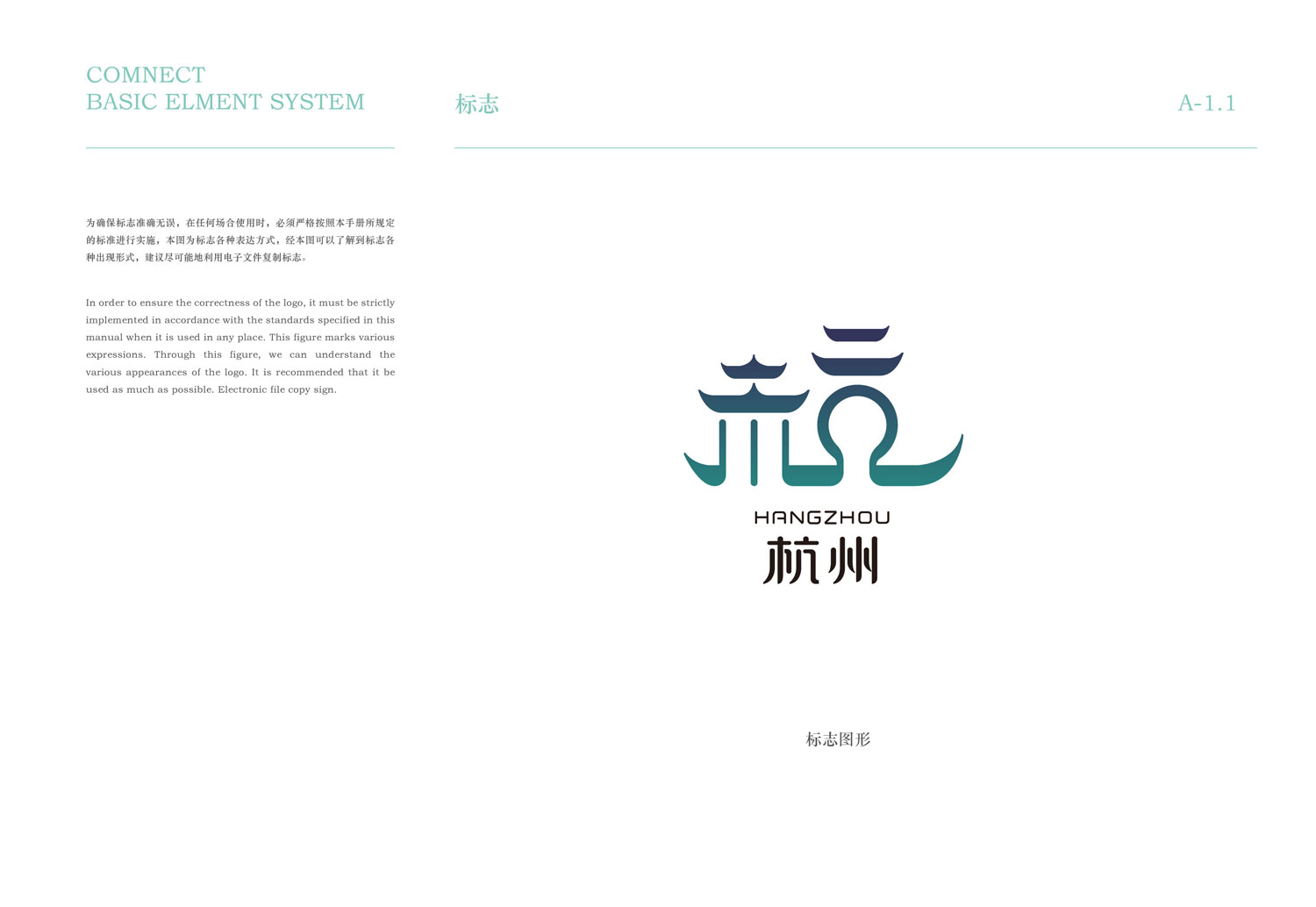
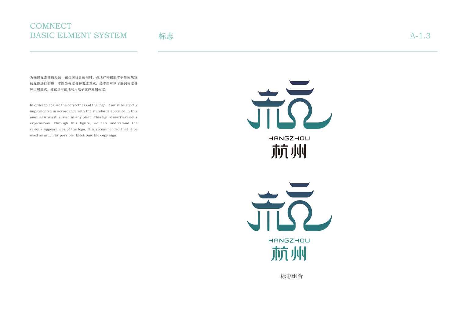
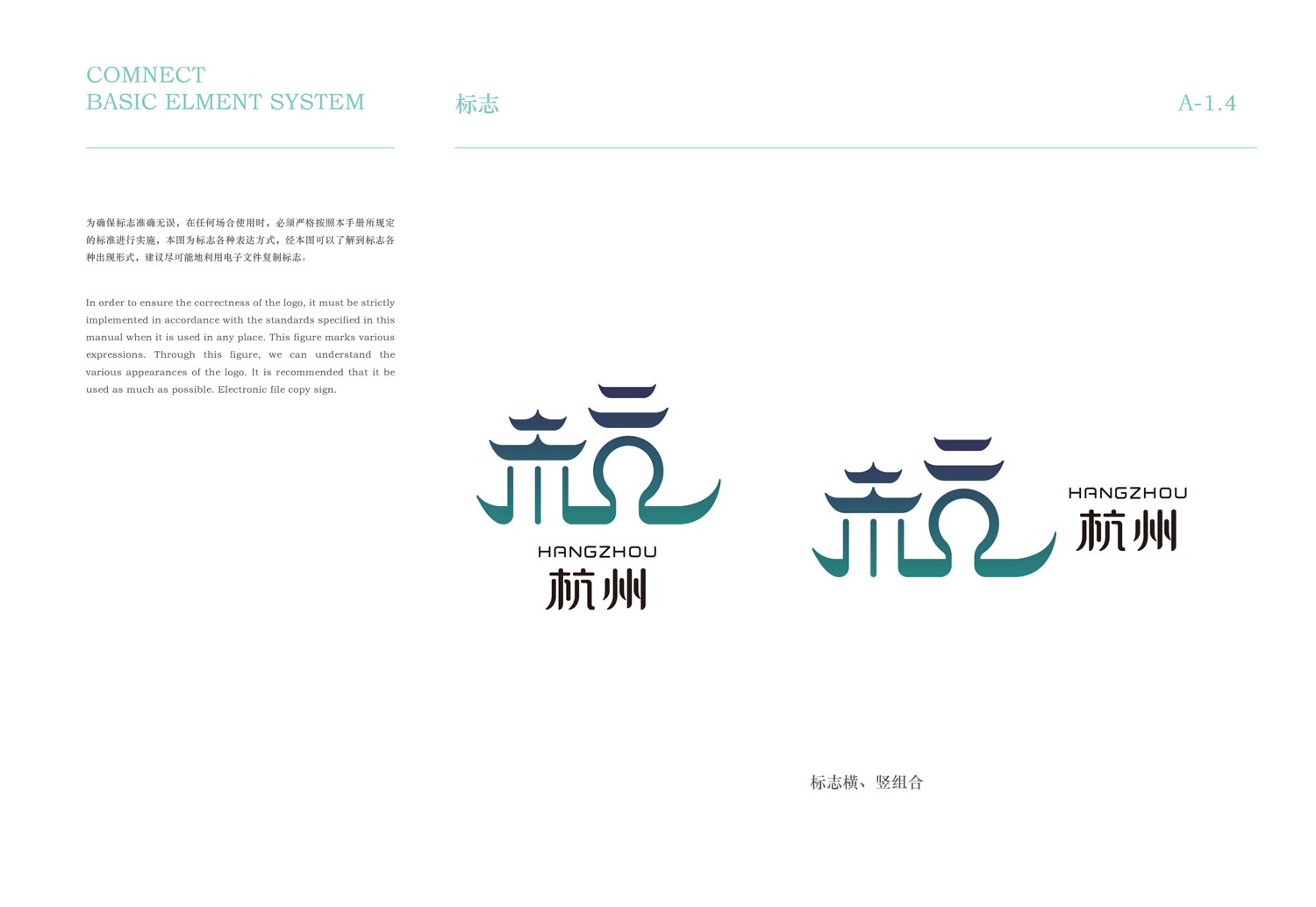
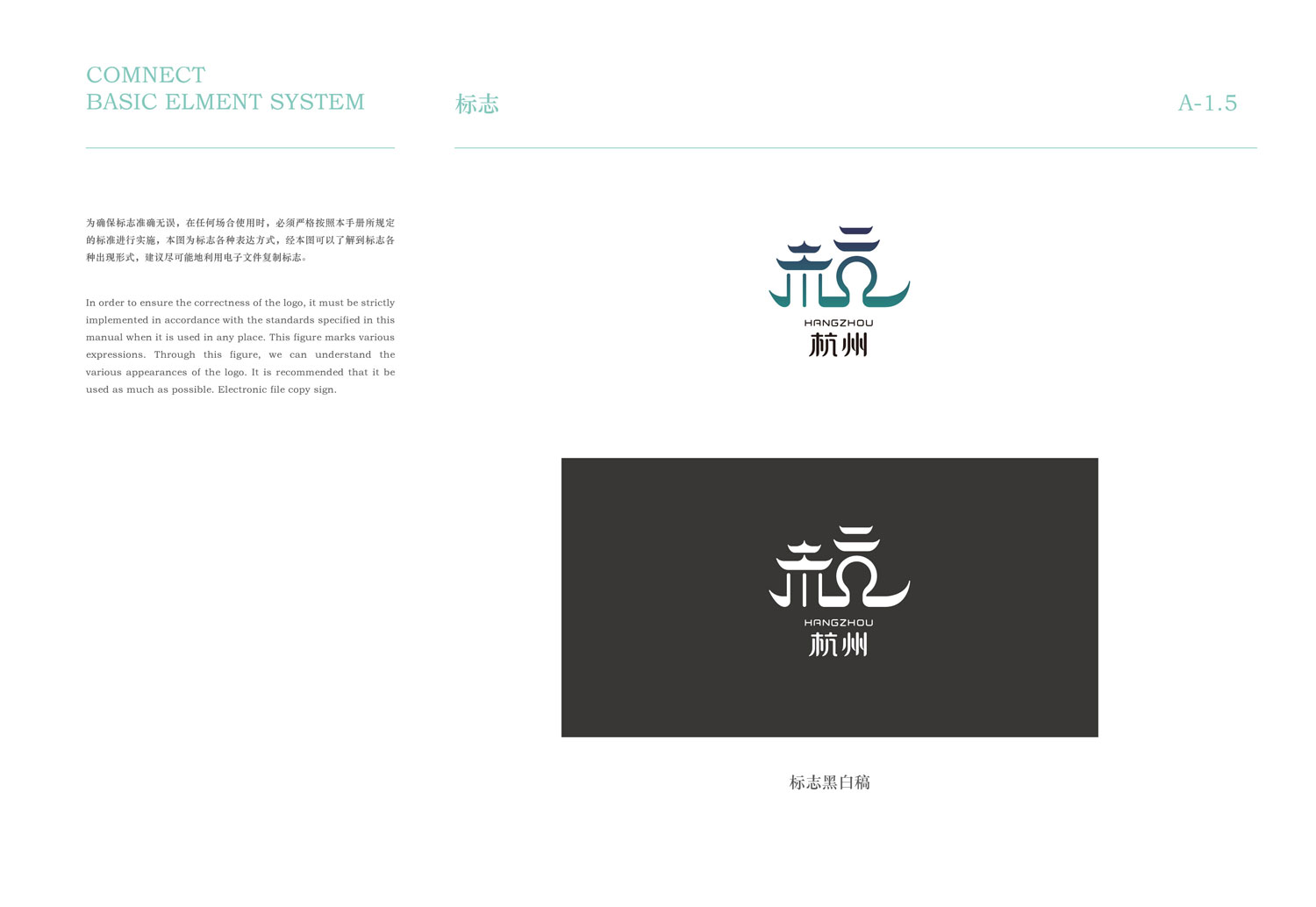
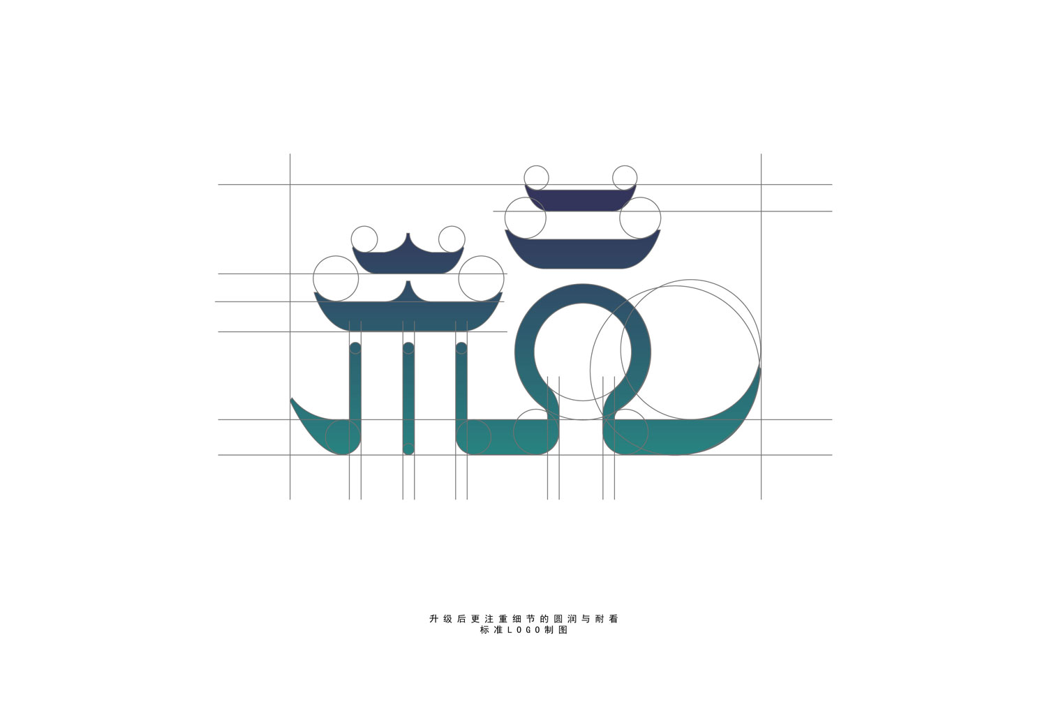
杭州LOGO的设计巧妙地采用了杭州传统亭子的层檐作为创意灵感源泉。在LOGO中,亭子的层檐形状被精心提炼,形成了“杭”字木字旁上半部分的造型。这些层檐不仅展现了杭州古建筑的典雅和精细工艺,还通过其曲线和线条赋予了LOGO流畅的动感和艺术感。层叠的檐口呼应了杭州独特的建筑文化,同时象征着城市的历史深厚和文化积淀。这种设计不仅在形象上表达了杭州的特色和身份认同,还通过其细腻的雕琢和结构性的排列,传达了对传统工艺和美学的尊重与传承。整体而言,亭子层檐在LOGO中的运用,既是对杭州建筑艺术的致敬,也是对城市文化的生动表达和诠释。
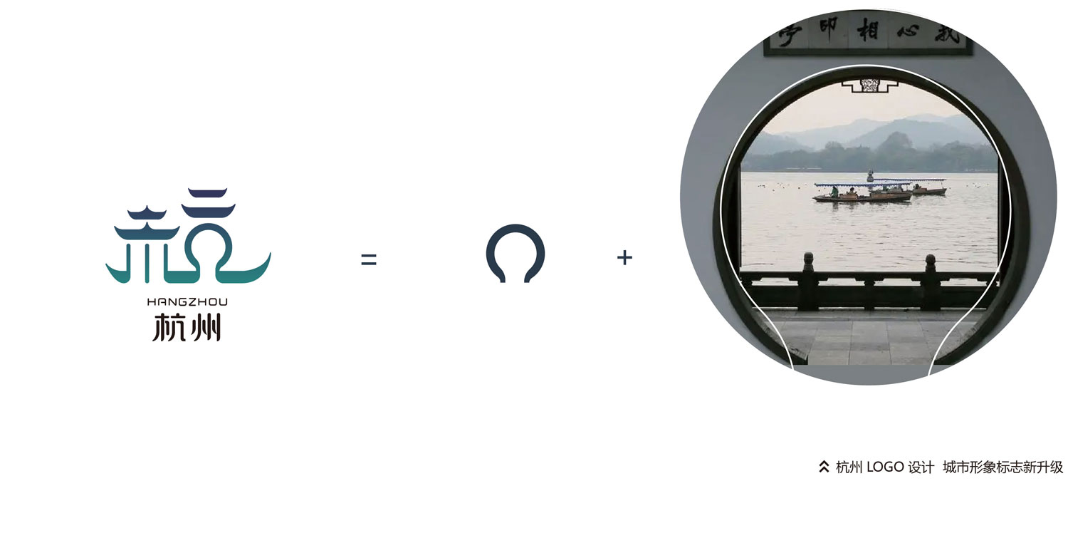
杭州LOGO设计精湛地运用了杭州古建筑中常见的圆形拱门元素,以独特的方式展现了杭州城市的文化底蕴和建筑特色。在LOGO中,圆形拱门被巧妙提炼成了“杭”字中的几字笔画,细腻地表达了杭州古建筑的雅致和建筑风格的独特韵味。这些拱门不仅象征着杭州城市的开放与包容,还反映了其历史悠久和文化深厚。通过几字笔画的排列和曲线的流畅连接,LOGO不仅在视觉上具有美感和艺术性,更重要的是,它通过这些精致的设计元素,传递了对杭州传统建筑艺术的尊重与传承。这种设计不仅令人联想到杭州古城的独特景观,还在微观的细节中展现了城市文化和历史的丰富内涵,为杭州LOGO赋予了深厚的文化意蕴和独特的视觉魅力。
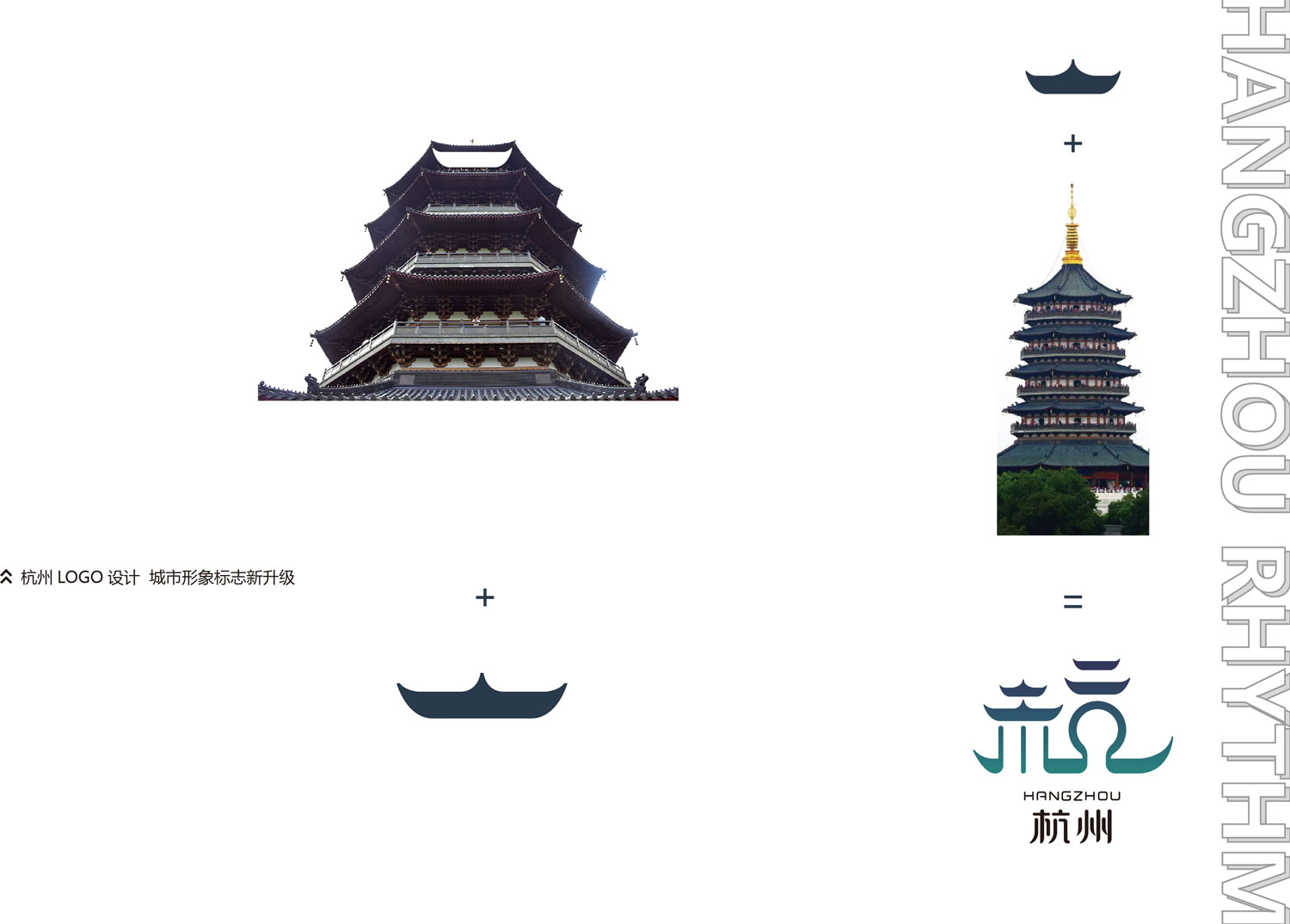
杭州LOGO的设计巧妙地运用了雷峰塔的元素,特别是木字旁上半部分的点和横线,灵感来源于雷锋墙塔顶的造型。这些笔画形态的提炼不仅巧妙地融入了杭州著名的历史建筑元素,还通过线条的曲折和形态的排列,表达了雷锋塔优雅的外观特征。点和横线的精细处理使得这些笔画在视觉上既独特又具有辨识度,同时展现了设计师对于杭州文化遗产的深刻理解和尊重。这种设计不仅使LOGO在视觉上具有深厚的文化底蕴和历史感,还通过艺术化的表现手法,将城市的独特魅力和传统价值完美结合。每一笔每一画的构图都精心设计,使得整体视觉效果既富有现代感又不失传统特色,为杭州LOGO赋予了深远的文化内涵和诗意表达,成为城市形象的精华之一。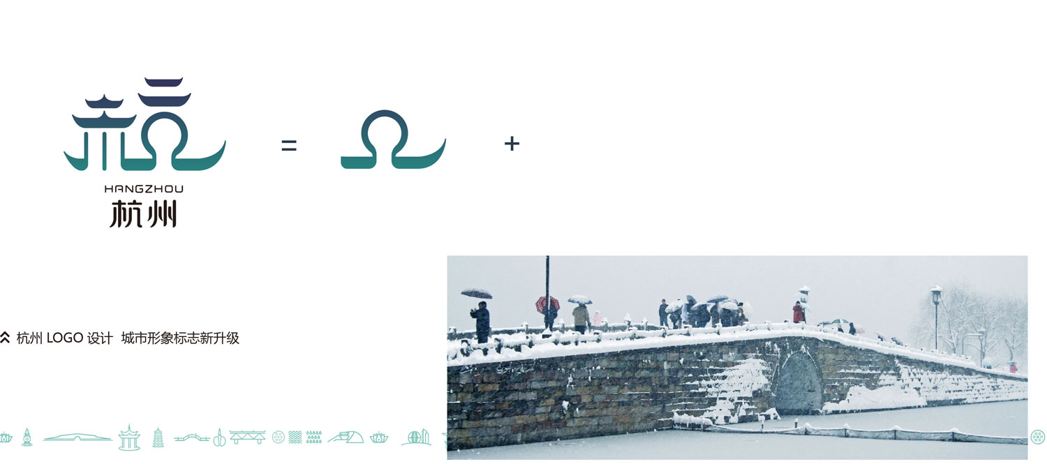
杭州LOGO的设计巧妙地利用了杭州著名的景点——断桥残雪的意象。在LOGO中,杭字的几个字笔画被艺术化地提炼和重组,形成了独特的视觉效果。这些笔画不仅在形状上像是断桥的残雪余晖,还通过线条的曲折和形态的排列,把这一著名景观的凝视与诗意表现得淋漓尽致。每一笔每一画的精细处理,都在微妙地勾勒出杭州城市的文化底蕴和独特风貌。通过这种富有诗意的设计,LOGO不仅展示了杭州作为文化名城的独特魅力,还通过视觉艺术的表现手法,引领人们进入了一种对历史与现代、传统与现代的精妙交融。这样的设计不仅具有观赏性和艺术性,更在细节处体现了对杭州文化遗产的尊重和表达,为LOGO赋予了深远的文化内涵和感染力。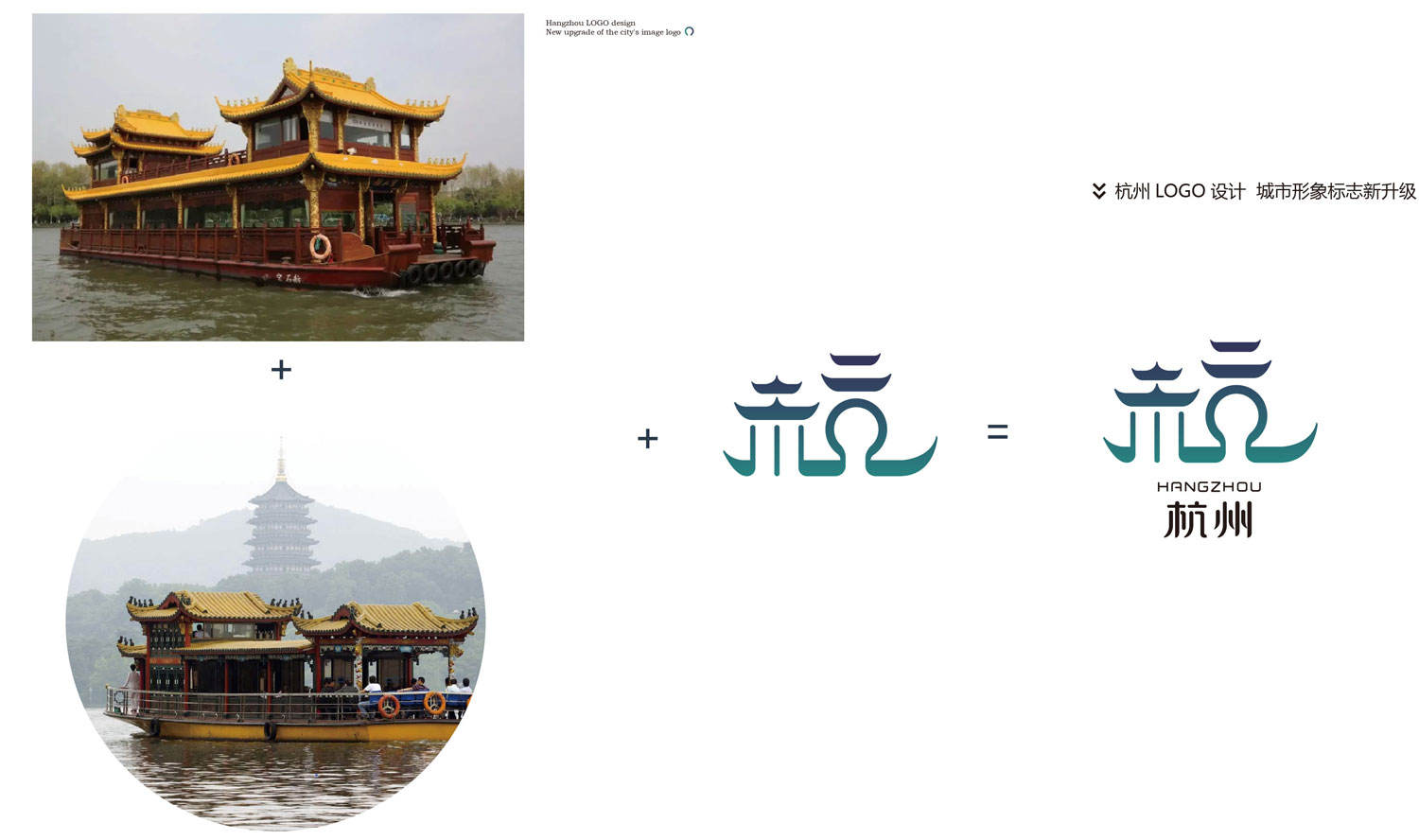
杭州LOGO的设计精妙地融入了西湖的元素,特别是游船在湖面上轻盈飘动的场景。整体字标的构图既稳定又富有灵动感,通过流畅的线条和优雅的曲线,恰如其分地表达了西湖的宁静与风光。游船的形象被巧妙地融入字体的结构中,不仅使整体视觉效果更加和谐流畅,还直观地诠释了杭州作为水乡城市的独特韵味。每一个线条和弧度都精心设计,既保留了传统的字形特征,又生动地呈现了西湖的动态美。这种设计不仅在视觉上具有吸引力和识别性,还通过细腻的表达方式,深刻地传达了杭州作为旅游胜地和文化名城的核心特质。整体设计的稳定感和灵动感使得LOGO在传达杭州城市形象的同时,也展现了对自然景观的敬仰与赞美,为城市的品牌形象增添了独特的魅力和诗意。
杭州城市形象LOGO的设计灵感源自于杭州独特的文化和建筑特色,旨在通过各种符号和形象,
传达杭州的历史、文化和自然风光。以下是对杭州LOGO设计创意的详细说明:
设计理念和元素解析
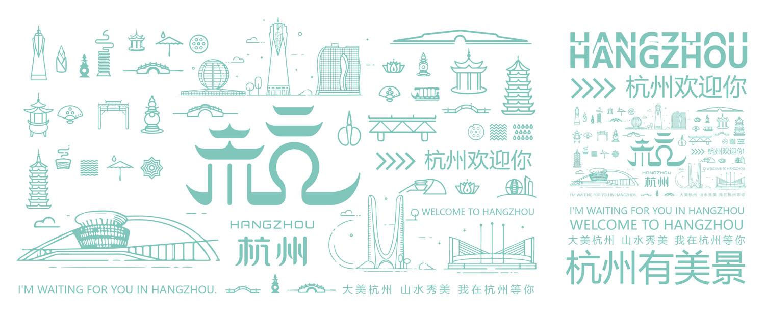
1.亭子的层檐和龙船的屋檐提炼
杭州的传统建筑以亭子和龙船为代表,具有独特的屋檐风格。LOGO中,亭子的层檐形状提炼出了“杭”字木字旁的上半部分,
象征着杭州古建筑的典雅和历史底蕴。龙船的屋檐则被提炼为整体“杭”字的造型,仿佛是古代游船在水中的流动形态,寓意着杭州作为水乡城市的特征。
2.圆形拱门的应用
圆形拱门作为杭州古建筑的典型元素,被用来提炼“杭”字中的几字笔画。这不仅展现了杭州独特的建筑风貌,还象征着城市文化的开放与包容。
3.“亢”字和“木”字的组合
“亢”字单独看来,其形状像是亭子的造型,与杭州古建筑的形态相呼应。而“亢”字的下半部分几字,则抽象地表现了像是断桥的下面桥洞的形状,
这是杭州著名的断桥的象征。亢字的第二层部分,则象征着杭州三潭印月的景观,这些小造型展示了城市的自然风光和文化遗产。
4.木加亢组合的湖中游船造型
最终,“木”字和“亢”字的组合形成了一个像是湖中游船的整体造型。这不仅展示了杭州作为水乡城市的形象,还体现了城市的和谐与发展。
主要元素和象征意义
1.西湖
LOGO的主要元素是西湖,它是杭州的代表性景观之一,象征着杭州的柔美、细致和宁静。
西湖的自然美景不仅吸引了无数游客,也代表了杭州独特的城市魅力和生活方式。
2.建筑和文化遗产
杭州作为历史悠久的文化名城,其独特的建筑风格和文化遗产为LOGO提供了丰富的灵感来源。
通过提炼亭子、龙船、拱门等建筑元素,LOGO不仅展现了城市的历史积淀,还传达了对传统文化的尊重和传承。
3.水乡特色
水是杭州城市形象的重要组成部分,体现在LOGO中的龙船和湖中游船造型上。
这些元素不仅突出了杭州作为水乡的特质,还表现了城市与水的深厚联系和共生关系。
杭州城市形象LOGO的设计创意融合了城市的自然风光、建筑特色和文化遗产,
通过亭子、龙船、拱门等象征性元素的提炼和组合,生动地展现了杭州独特的城市魅力和历史底蕴。
LOGO不仅具有视觉上的美感和艺术价值,更重要的是,它通过形象的方式传递了关于杭州的故事和情感,
让人们更加深入地了解和体验这座城市的魅力所在。
Inspired by Hangzhou's unique cultural and architectural features, the Hangzhou city image LOGO is
designed to convey Hangzhou's history, culture and natural beauty through various symbols and images.
The following is a detailed description of the Hangzhou LOGO design idea:
Analysis of design concepts and elements
1. Refinement of the tiered eaves of the pavilion and the eaves of the dragon boat
Hangzhou's traditional architecture is represented by pavilions and dragon boats, which have a unique eaves style.
in the logo, the shape of the pavilion's eaves is extracted from the upper part of the wooden side of the character "Hang",
symbolising the elegance and historical heritage of Hangzhou's ancient architecture. The eaves of the dragon boat are
refined into the shape of the word "Hang" as a whole, as if it is the flowing form of an ancient cruise ship in the water,
symbolising the characteristics of Hangzhou as a water town.
2. Application of round arches
As a typical element of Hangzhou's ancient architecture, the round arch is used to refine the strokes of the character
"Hang". It not only shows the unique architectural style of Hangzhou, but also symbolises the openness and tolerance of the city's culture.
3. Combination of the characters "亢" and "木".
On its own, the character "亢" looks like the shape of a pavilion, echoing the shape of Hangzhou's ancient architecture.
The lower part of the character "亢" abstractly represents the shape of a hole underneath a broken bridge, a symbol of the
famous Broken Bridge in Hangzhou. The second part of the character "亢" symbolises the view of the Three Pools and the Moon in
Hangzhou, and these small shapes show the city's natural scenery and cultural heritage.
4. The combination of wood and hyper in the shape of a boat in the lake
Finally, the combination of the characters "木" and "亢" creates an overall shape that looks like a boat in the lake.
This not only shows the image of Hangzhou as a water town, but also reflects the harmony and development of the city.
Main elements and symbolism
1. West Lake
The main element of the logo is the West Lake, which is one of the representative landscapes of Hangzhou,
symbolising its softness, delicacy and tranquillity. The natural beauty of the West Lake not only attracts countless
tourists, but also represents Hangzhou's unique urban charm and lifestyle.
2. Architectural and Cultural Heritage
As a cultural city with a long history, Hangzhou's unique architectural style and cultural heritage provide a rich
source of inspiration for the logo. By refining architectural elements such as pavilions, dragon boats and arches,
the logo not only shows the city's historical deposits, but also conveys the respect and inheritance of traditional culture.
3. Water Town Characteristics
Water is an important part of Hangzhou's city image, which is reflected in the shape of the dragon boat and
the boat in the lake in the logo. These elements not only highlight the qualities of Hangzhou as a water
town, but also show the deep connection and symbiotic relationship between the city and water.
The design idea of Hangzhou city image LOGO integrates the natural scenery, architectural characteristics
and cultural heritage of the city, and vividly shows the unique charm and historical heritage of Hangzhou
through the refinement and combination of symbolic elements such as pavilions, dragon boats and arches, etc.
The LOGO is not only visually beautiful and artistically valuable, but also, more importantly, conveys the stories and
emotions about Hangzhou through the image, allowing people to more deeply understand and experience this city.
More importantly, it conveys stories and emotions about Hangzhou through images, allowing people to
understand and experience the city's charms more deeply.
Translated with DeepL.com (free version)